Identity developed for Taree Universities Campus
The Taree Universities Campus project continues to prove a magnet for local talent eager to be involved in such an exciting undertaking.
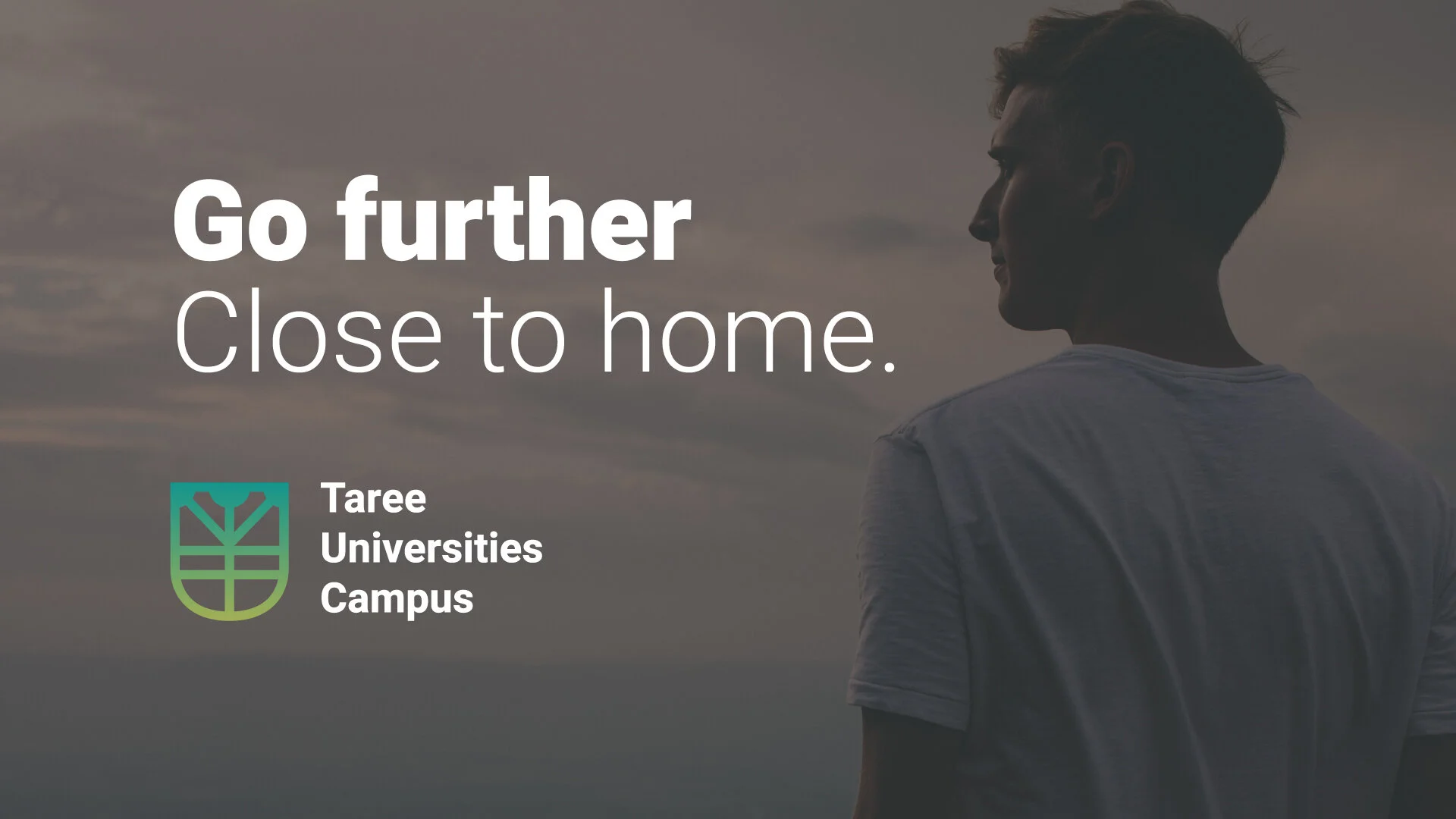
TUC has launched their new website, logo & brand identity, developed by local small business marketing consultant Meredith Paige - based in Tuncurry, Meredith is thrilled to be a part of the development of the Campus identity.
“Our region is full of so much untapped potential in its residents. It would a career highlight for me, being a part of bringing University education within reach of more MidCoast locals. My degree has allowed me to develop the skills I needed to move to the area, raise a family here and still enjoy a flourishing professional career. If I can help make that possible for more people - what a gift for me!”
The logo brings together a number of concepts echoing both our region and our vision for it’s residents. The ‘U’ shape reflects the distinctive structure of Martin Bridge at the entrance to Taree, in turn promoting the idea of ‘bridging the gap’ between our residents and university access. Bridges are also prevalent throughout the MidCoast, which has been used as a way to signify how the university intends to bring our towns together.
The key phrase '“Go further close to home” captures our desire to support MidCoast residents in extending themselves to their fullest potential, all whilst enjoying the security and familiarity of their hometowns.